
Designing a brand & web experience for an outbound agency that takes a different approach
- Branding
- Web design & development
Market Fit, a LinkedIn outbound agency, was looking for a distinctive brand identity that could be expressed across a new website landing page, versatile for future touchpoints.
Carving out a unique visual positioning for the brand
Exploring the ways Andrew, Founder of Market Fit, wanted the agency to be perceived, we quickly made the realisation that LinkedIn outbound was saturated with corporate-feel brands “blue-washed” to assimilate with LinkedIn and the wider tech community.
That visual affiliation does little for who Market Fit’s customers actually serve, so avoiding it became the first requirement - visually setting Market Fit apart from its competitors.
In the ideation stage, every logo mark was paired with a landing page concept to better realise how the visual language could be expressed across content and assets.
Subtle messaging expressed in the logo mark
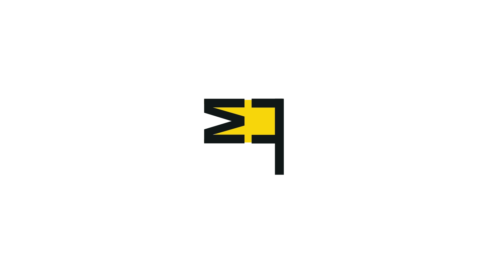
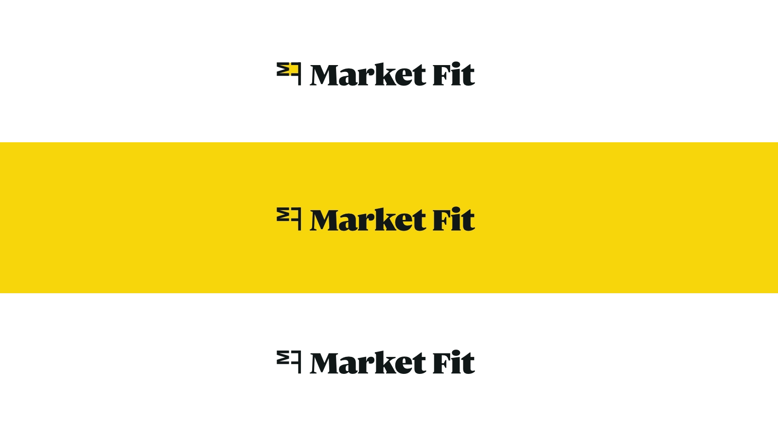
Exploring shapes and forms, we landed on a logo mark directly inspired by the anagram of Market Fit. While subtly nodding to both letters ‘M’ and ‘F’, it’s composition creates a flag.
Market Fit helps early-stage startups validate their ICP and positioning in the market, as they manage outbound - so the flag represents their mission of placing a stake in the ground for their clients.
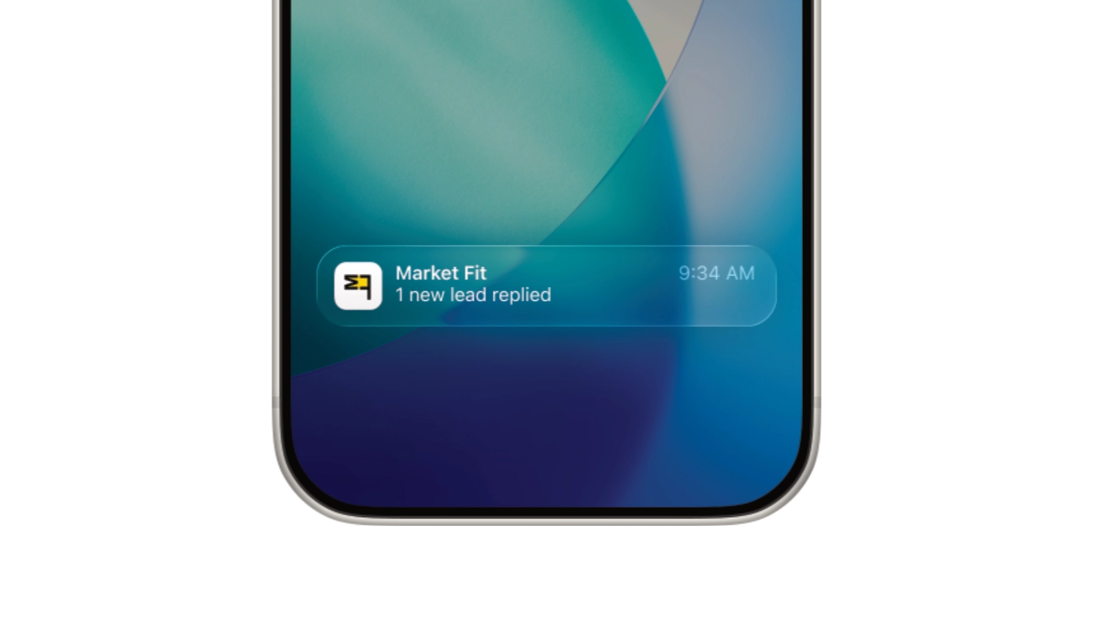
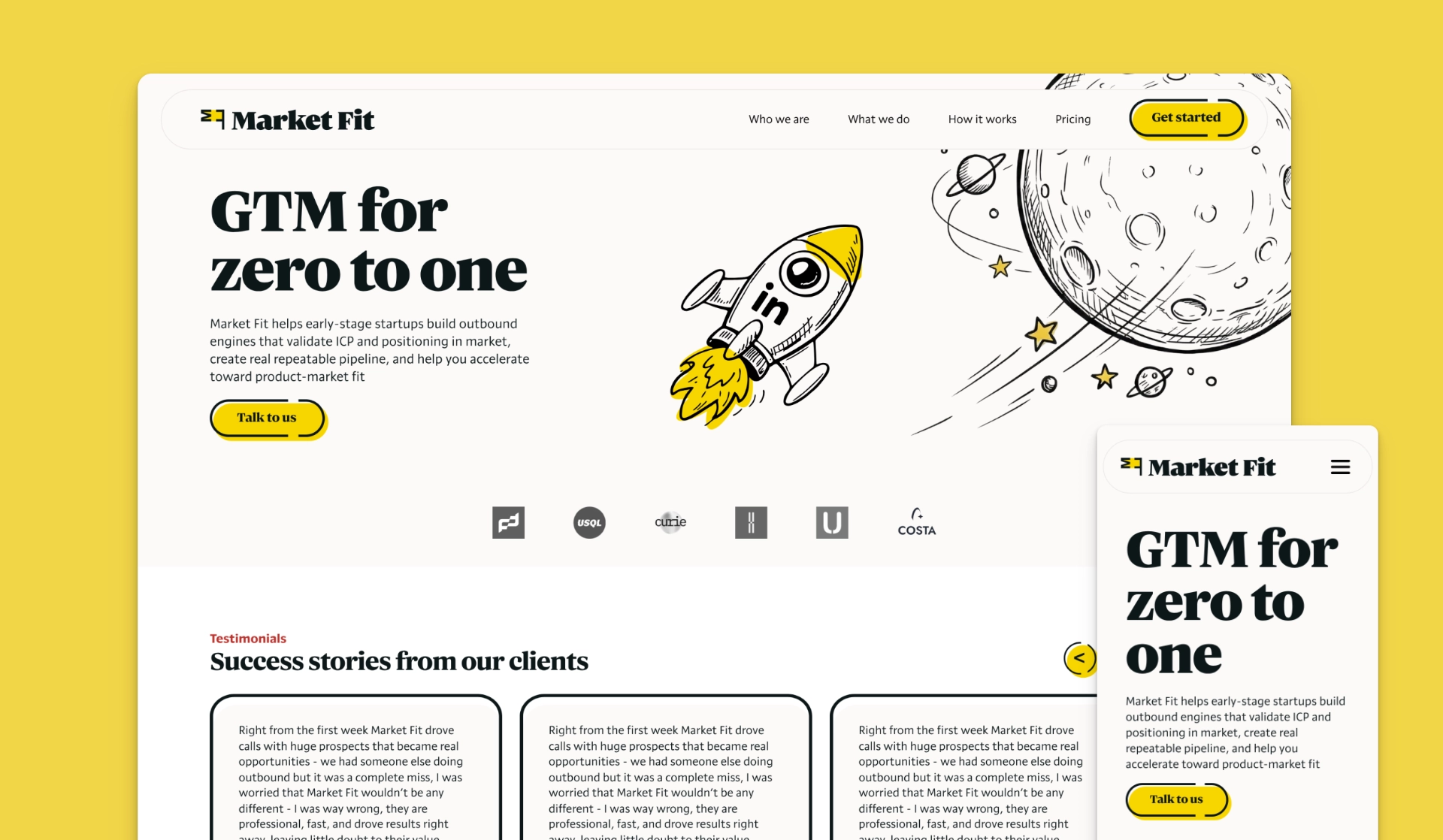
Extending the visual identity onto the website
Once we agreed to move forward with this concept, and the landing page already followed a visual style, we continued to experiment with widgets that expressed this playful sketched look, making use of the accent colour as well as the bold dark outline featured in the logo.
Applied in Andrew’s current Framer website, the result is a bespoke designed landing page that the client can make copy changes to and a strong visual style.